You know that moment when you can’t find your keys? You search everywhere and then, bam! They’re in your pocket. It’s like a mini detective story unfolding right there.
Well, scientific research is a bit like that. Sometimes it’s all about connecting those dots, figuring out what goes where.
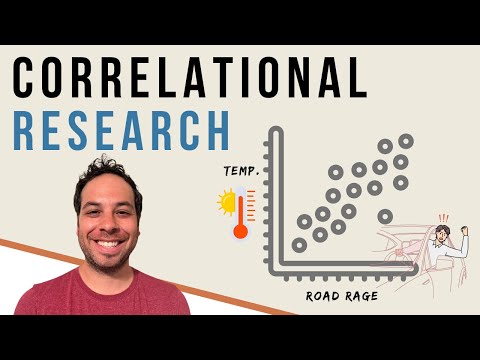
Correlation studies are where the magic happens. They help us see relationships between different things, kind of like piecing together a puzzle—but without that one pesky corner piece you can never find!
Ever thought about how coffee could be linked to creativity? Or how rainy days might affect our mood? It’s wild how different bits of data can tell us a story when we look closely.
So, let’s chat about correlation studies and why they matter. Trust me; once you get into it, you’ll start seeing connections everywhere!
Exploring Correlation Studies in Scientific Research: Key Examples and Connections
So, correlation studies, huh? They’re like the early bird of scientific research. You know, checking whether two things relate to each other before diving deeper into causation. Let’s break it down.
What is Correlation?
Basically, correlation refers to a relationship between two variables. If one changes, the other might too. But—and this is important—just because they move together doesn’t mean one causes the other. It’s like when you notice that ice cream sales go up in summer while drowning in your own thoughts about the warm weather. Are they related? Sure! But eating ice cream isn’t what makes it hotter outside.
Types of Correlation
There are a few ways that correlation can show itself:
- Positive Correlation: When both variables increase or decrease together. Like hours spent studying and grades on a test.
- Negative Correlation: When one variable goes up while the other goes down, such as increased exercise and weight gain.
- No Correlation: When there’s no relationship at all—like your shoe size and your favorite color!
Now let’s take a look at some key examples of correlation studies in action!
A Classic Example: The Ice Cream and Drowning Case
Remember the ice cream example? Statistically speaking, there’s a positive correlation between ice cream sales and drowning incidents during summer months. Shocking, right? The spike in both has more to do with warmer weather than any causal link between enjoying frozen treats and swimming safety (cue the lifeguards!).
The Health Connection
Consider studies looking at coffee consumption and health outcomes. Some research shows that higher coffee consumption correlates with lower rates of certain diseases like Parkinson’s or diabetes! Now, does drinking coffee make you healthier? Not necessarily—it could just be that coffee drinkers have other healthy habits.
Census Data Insights
Research using census data often explores correlations too! For instance, you might find that areas with higher education levels tend to have lower crime rates. Again, it’s not saying education prevents crime directly but indicates a complex web of social factors working together.
The Takeaway
So why should we care about these studies? Well, they help scientists make **connections** without needing all the details figured out yet! They highlight patterns worth exploring further while allowing researchers to propose hypotheses for deeper investigation later on.
To sum it up: correlation studies are like those friend connections you’ve got—not always direct but definitely worth looking into when you’re trying to understand complicated stuff going on around us! They spark curiosity and lead to bigger questions about our world and how we interact with it—or don’t—in some cases, right?
Comprehensive Guide to Microbiome Network Analysis Using R: Techniques and Applications in Scientific Research
Alright, let’s chat about microbiome network analysis and how you can rock it using R. Seriously, if you’ve ever wondered how those tiny microbes in your gut can affect everything from your mood to your digestion, you’re in for a treat! It’s like a whole universe of tiny life forms just waiting to be explored.
First off, the microbiome is basically all the microorganisms that live in and on us—bacteria, viruses, fungi—you name it. These little guys play a huge part in our health but also in lots of scientific studies. This is where network analysis comes into play, helping researchers understand how these microbes interact with each other and with us.
Now let’s get into the nitty-gritty with some techniques used for microbiome network analysis. In R, there are several packages that make this super manageable:
- igraph: This is a powerful library for creating and manipulating graphs. You would use it to visualize interactions between different microbial species.
- phyloseq: Perfect for handling microbiome data—think sequencing data from gut samples or anything similar.
- networkD3: If you want to make those networks interactive for better presentations or reports, this package can help you out big time.
So what do we actually do with these tools? Well, one major application is identifying co-occurrence patterns. Let’s say you find that certain bacteria seem to hang out together more often than chance would suggest. That could indicate they’re working together in some way—maybe one helps the other survive!
Another cool aspect is exploring how networks change under different conditions. Like imagine studying two groups: one with healthy guts and another with issues like IBS. You could compare their microbiomes and see how the connections differ. It’s almost like detective work!
Now let’s chat about data collection for these analyses. Usually, you’ll gather high-throughput sequencing data. This means you’re getting tons of genetic material from the microorganisms present in a sample—super detailed stuff! After you’ve got your data prepped (often using sequences), it needs cleaning up (removing noise) before diving into analysis.
Once you’re ready to analyze data using R, remember that visualization plays a massive role. Effective visualizations can tell stories that raw numbers just can’t express well—think color-coded networks showing strong vs weak connections among microbes.
But don’t forget about validation! Network analyses need validation through biological experiments or existing literature to back up findings. If something looks cool on a graph but doesn’t hold up when tested biologically—it might lead you astray.
Lastly, always be ready for new developments! The field of microbiome research is evolving rapidly; new techniques and findings are popping up all the time thanks to advances in technology and methodology.
So there you have it—a glimpse into the world of microbiome network analysis through R! By connecting these tiny dots, researchers are not just learning about our tiny friends but also uncovering big insights into health and disease! Pretty neat stuff if you ask me!
Exploring Illusory Pattern Perception: Insights into Cognitive Science and Visual Processing
Illusory pattern perception is one of those mind-bending concepts that makes you realize just how quirky our brains can be. Essentially, it’s when your brain sees patterns or connections that aren’t really there. It’s like when you look at clouds and see a dragon, even though it’s just a fluffy bunch of vapor. But let’s break this down to understand what’s going on.
When we talk about cognitive science, we’re diving into how our minds work—how we learn, remember, and perceive things. Illusory patterns are a perfect example of the brain’s interpretation skills run amok. Your eyes take in visual information, but your brain does the heavy lifting by creating meaning from what it sees. Sometimes it gets a little too creative!
This is where visual processing comes into play. Our brains are hardwired to look for connections and make sense of chaos. It’s a survival instinct, really! Imagine you’re out in the wild, and you hear rustling in the bushes; your brain quickly assesses if that’s a friendly rabbit or a sneaky predator. When you’re processing visual cues in everyday life, your mind tends to fill in gaps using prior knowledge and expectations.
You might ask yourself, “So what does this have to do with scientific research?” Well, illusory pattern perception ties into how researchers interpret data too! For instance:
- Correlation vs Causation: Just because two things happen together doesn’t mean one causes the other.
- Data Overload: With tons of data available today, it’s super easy to see patterns that aren’t actually there.
- Confirmation Bias: Researchers might focus on data that supports their hypothesis while ignoring evidence to the contrary.
It reminds me of this time I was at an art gallery. There was this abstract painting full of swirls and splotches—at first glance it looked chaotic! But people were standing there pointing out faces and animals they saw hidden in the mess. Each person had their own interpretation based on their experiences. That’s just like how scientists can view the same dataset and reach different conclusions depending on their perspectives.
Another interesting aspect is cognitive biases which influence how we perceive patterns as well as decisions we make based on them—like thinking there’s an increase in crime rates because you’ve seen more news reports about it recently; but maybe those reports don’t reflect reality accurately.
In short, exploring illusory pattern perception gives us insight into both personal cognition and collective scientific inquiry. It serves as a reminder: our brains are remarkable but also sometimes lead us down paths where we think we see connections that simply aren’t real! So next time you catch yourself spotting something unusual in a random set of images or statistics, remember—it might just be your brain getting playful with its creativity!
You know, when you hear about scientific research, it can sometimes feel like a jumble of numbers and complex theories. But think about it: all that data is really about connecting the dots. Correlation studies are one of those cool ways scientists try to figure out how things relate to each other. It’s like being a detective in a giant puzzle, where each piece gives you a bit of insight into the bigger picture.
I remember this time I was chatting with my buddy who was super into stats. He told me about a study that found a correlation between having plants in your office and higher productivity levels. At first, I thought, “Okay, sounds interesting but is it real?” Then we dove deeper together and learned they didn’t just pluck numbers out of thin air. They gathered data from lots of different offices over time, which added some weight to their findings.
But here’s where things get tricky, right? Just because two things correlate doesn’t mean one causes the other. That’s why correlation doesn’t equal causation should be the mantra for anyone diving into research. For instance, if you notice that ice cream sales go up at the same time as shark attacks rise (wild example, I know), you can’t just say that eating ice cream makes sharks come closer or something! It’s more likely there’s another factor—like summer weather—leading to both.
So, when connecting those dots in research, it takes critical thinking and often multiple studies to really see what’s happening underneath the surface. Scientists have to consider variables—like age or environment—that could sway results in unexpected ways. You see the beauty of science lies in its messy nature; it challenges us to ask questions and keep exploring rather than sticking with what seems obvious at first glance.
I guess what I’m getting at here is that science is a lot like life; it requires curiosity and patience as we sift through layers of information. Next time you hear a study claiming two things are related, take a moment to ponder what else might be going on behind those connections. And who knows? You might just discover something new along the way!