So, imagine you’re trying to figure out if the number of hours you spend binge-watching your favorite show actually impacts your mood the next day. You might notice that the more you watch, the happier—or maybe crankier—you feel, right?
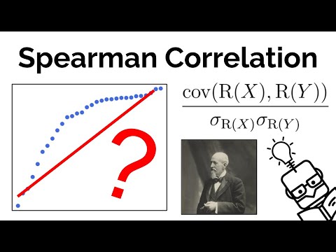
That’s where something called “Spearman correlation” comes into play. It sounds fancy but don’t let that scare you. It’s all about seeing how two things relate to each other without getting bogged down by some of those complicated stats you hear about.
It’s like trying to find a connection between your snack choices and your productivity levels during a lazy Sunday. You know there’s a link, but it can be tricky to pin down exactly what it is. That’s what Spearman helps with!
Whether you’re diving into research or just curious about data and relationships, understanding this concept can really open your eyes. So, let’s unpack this together!
Understanding When to Apply Spearman Rho: A Guide for Scientific Research
So, let’s talk about Spearman Rho. This stuff is pretty important if you’re into stats and research. Basically, you use Spearman’s rank correlation coefficient when you wanna figure out how well two variables relate to each other, but here’s the kicker: it doesn’t assume that those variables are normally distributed.
When to apply Spearman Rho? That’s the million-dollar question. You’d typically go with this method when:
- Your data isn’t normally distributed: If your data isn’t bell-shaped or perfect, Spearman Rho saves the day! So, if you’ve got ordinal data or non-linear relationships, this method is your best bud.
- Dealing with ranked data: If you’ve got ranks instead of raw scores—like survey responses—you wanna use this. It works perfectly with things like “strongly disagree” to “strongly agree” scales.
- Outliers are throwing you off: Seriously, outliers can mess up your analysis. Because Spearman focuses on the ranks, it’s less influenced by these pesky outliers.
Let’s imagine a scenario: say you’re studying students’ test scores and their study hours but notice that some scores just don’t make sense—they’re way too high or low compared to others. You could run a Spearman Rho test here and get a clearer picture without letting those odd scores skew your results.
Now let’s get into how it actually works. You rank the values for both variables you’re comparing. Let’s say you’ve got two sets of numbers: one for hours studied and another for test scores.
Then it gets mathy! For each pair of ranks, you find the difference (d) between them, square it (d²), and plug those into this formula:
Spearman Rho = 1 – (6 * Σ d²) / (n(n²-1))
Where n is the number of pairs of rankings. Sounds complicated? It kinda is! But once you run those numbers through correctly, voila—you get a correlation coefficient that ranges from -1 to +1.
– A value close to 1 means a strong positive correlation.
– A value near -1 means a strong negative correlation.
– And around 0? Well, there’s basically no correlation at all.
So why does this matter? Let’s say after applying Spearman Rho in your research on study habits versus test scores, you find a strong positive correlation around +0.85. That tells you that as students study more hours, their test scores improve significantly! Super useful info for educators or program developers!
In short—the key points about when to apply Spearman Rho boil down to: working with non-normally distributed data, handling ranked data effectively, and keeping an eye on outliers messing things up.
Just remember that stats can feel overwhelming sometimes! But getting comfy with tools like Spearman Rho can help clarify relationships in your research work like nobody’s business. And who doesn’t want clearer insights from their data?
Exploring the Applicability of Spearman Correlation for Analyzing Categorical Data in Scientific Research
So, let’s chat about Spearman correlation and how it fits into the world of categorical data in scientific research. If you’ve ever had a chance to look at data and wondered how to measure the relationship between two variables, well, Spearman’s correlation is one tool that can really help out.
First off, what is Spearman correlation? Basically, it’s a statistical measure that helps us understand how closely two sets of ranks relate to each other. Unlike Pearson’s correlation, which deals with continuous data and assumes a linear relationship, Spearman works with ordinal data. This means it can handle categories that have an order but not necessarily even spacing between them.
You know when you rank something like your favorite ice cream flavors? You might put chocolate at number one and vanilla at number two. That’s ordinal data—there’s a clear ranking, but the difference in preference isn’t measured in numbers. Those rankings are precisely what Spearman focuses on!
Now, you might be wondering about its applicability for analyzing categorical data—like survey responses where people choose from different options. Here’s the cool part: if you’ve got ordered categories (like ratings from 1 to 5), Spearman can help you see if there’s a relationship between whatever two things you’re studying. For instance:
- Relationship Analysis: If you’re looking at student study hours and their exam scores (ranked), Spearman will give you an idea of whether more hours lead to better scores.
- Non-parametric: It doesn’t assume that your data meets certain conditions like normal distribution. That’s pretty handy because many real-world datasets don’t comply with these assumptions.
- Handling Ties: If your categories have tied ranks (say multiple people gave the same rating), Spearman has a way to handle that without getting too cranky about it.
But here’s something important: while it’s excellent for ranked or ordinal data, if your categorical variables lack any order (like eye color or types of fruit), then Spearman isn’t going to cut it.
Imagine this: you’re analyzing survey results where participants choose colors they like—red, blue, green—but there’s no inherent ranking among those colors. Using Spearman here would be like trying to fit a square peg into a round hole—it just won’t work.
To wrap it up, using Spearman correlation for analyzing categorical data can be incredibly useful when dealing with ordered categories. It gives researchers insights into relationships without requiring strict assumptions about the underlying distribution of their data.
So next time you’re sifting through some survey results or looking at ranked choices in your research project, keep this nifty tool in your back pocket!
Understanding Spearman Correlation: A Key Statistical Tool in Scientific Research and Data Analysis
Understanding Spearman Correlation is like having a trusty tool in your data analysis toolkit. So, what’s this Spearman Correlation all about? Well, it’s a method used to measure the relationship between two variables. But here’s the kicker: it doesn’t depend on the assumption that both variables are normally distributed, which is pretty cool if you think about it.
What is Spearman Correlation?
Basically, this correlation assesses how well the relationship between two variables can be described using a monotonic function. This means that as one variable increases, the other either increases or decreases consistently. It’s especially handy when your data isn’t linear!
Let’s say you’re looking at data from a science experiment where students’ hours of study relate to their test scores. You might find that more study time generally leads to higher scores, but not always in a straight line—some people might really hit a wall after too many hours!
How is it calculated?
To calculate Spearman Correlation, you first rank your data points. For example, if you have two sets of numbers (like study hours and test scores), you’d replace each number with its rank in the list. Then you can use those ranks to calculate what’s known as the coefficient.
Here are some key points about this coefficient:
- Value Range: It ranges from -1 to 1.
- Perfect Positive Correlation: A value of 1 means as one variable increases, so does the other perfectly.
- Perfect Negative Correlation: A value of -1 means as one variable increases, the other decreases perfectly.
- No Correlation: A value around 0 indicates no apparent relationship between those variables.
Example in Practice
Imagine you’re studying how temperature affects ice cream sales over summer months. You could collect data on daily temperatures and ice cream sales, then analyze them with Spearman Correlation. If you find a strong positive correlation, it suggests that warmer days lead to more ice cream sold—a pretty obvious but fun finding!
Why Use It?
Spearman is super useful because it works well with ordinal data—data that can be ranked but doesn’t necessarily have equal intervals between ranks. Think about survey ratings from “poor” to “excellent.” You can still glean insights even if you can’t precisely quantify every step in between.
Plus, it’s robust against outliers! If there’s an unusual score in your dataset—a surprising exam result or an oddball temperature—Spearman won’t go haywire like some other tests might.
In summary, using Spearman Correlation lets researchers dive into relationships without needing everything to fit into neat little boxes. It’s versatile and makes sense for lots of different scenarios! So next time you’re analyzing your own data or tackling someone else’s findings, remember this gem—it might just give you that extra edge!
Alright, so let’s chat about the Spearman correlation—it sounds all fancy, but it’s really just a clever way to figure out if two things are related in a specific kind of way. Imagine you and your buddy are trying to see if there’s a link between how much time you spend studying and your grades in school. The Spearman correlation helps you do that by looking at ranks rather than specific numbers.
Now, here’s the thing: this method is especially useful when your data isn’t super strict or smooth. Like, if you wanna know if tall people tend to wear bigger shoes, but the heights and shoe sizes are all over the place—Spearman’s your buddy! It doesn’t get hung up on exact measurements; instead, it just cares about their order. So for instance, if you’re ranked 1st in height and your friend is ranked 2nd, it doesn’t matter if you’re 5’8” and they’re 5’7” or whatever. You see what I mean?
I remember this one time in college when I was working on a project with some pals. We had tons of data from our psychology class about study habits and test scores—such a mess! We were trying to make sense of it all, like trying to untangle headphones after they’ve been sitting in your pocket for days. One of my friends suggested using Spearman’s correlation after realizing our data was pretty wonky. And wow, it was like flipping a switch; suddenly we could see clear patterns emerge!
It’s like that moment when you finally find out why your favorite song gives you chills—it just fits together perfectly. Using Spearman showed us that even though people studied at different times or in different ways, there was still this neat little link between their efforts and results.
So yeah, while Spearman’s correlation might seem like just another tool in the toolbox of research—it can actually open up some real insights when you’re navigating through messy data! It reminds us not everything has to be precise; sometimes we just gotta feel the rhythm of what’s happening beneath the surface. And isn’t that what science is really about? Finding those connections—even when they’re not exactly straight lines?