Okay, so picture this: you’re trying to guess how much candy you can snag from that giant bowl at the Halloween party. You look around and see how much everyone else has. You notice something funny; the taller kids seem to be grabbing more candy.
It’s like, “Hey, what gives? Is there a candy height advantage?” Well, this is kinda where linear regression steps in!
You’re basically using past data to predict future outcomes, and it sounds way more complicated than it really is. But seriously, it’s just a neat little trick that helps us make sense of patterns in data.
So grab your favorite treat (maybe some of that Halloween candy?), and let’s break down linear regression with a simple example. Trust me; it’ll be way more fun than it sounds!
Mastering Simple Linear Regression: Example Problems and Solutions for Science Applications
So, let’s talk about simple linear regression. It sounds all fancy, but it’s really just a way to figure out how two things are related. Think of it like looking for a connection between the number of hours you study and the grades you get on your tests.
Imagine you’re in school. You’ve been keeping track of your study hours each week and your corresponding test scores. You could jot this down like this:
- Study hours: 2, Test score: 70%
- Study hours: 3, Test score: 75%
- Study hours: 4, Test score: 80%
- Study hours: 5, Test score: 85%
The next step is to draw a graph with ‘study hours’ on the x-axis (the horizontal one) and ‘test scores’ on the y-axis (the vertical one). When you plot those points on the graph, you might start seeing a pattern. The more you study, the higher your test scores seem to be. Pretty cool, right?
This is where linear regression steps in. What’s that? Well, it helps you find the best line that goes through those points on your graph. Basically, it gives you an equation that best fits your data! Think of it as drawing a line that’s as close as possible to all those dots.
The equation looks something like this:
y = mx + b,
where:
- y is what you’re trying to predict—like your test score.
- x is the input—your study hours in this case.
- m is the slope of the line—it tells you how much y changes when x increases.
- b is the y-intercept—this is where your line crosses the y-axis when x equals zero.
You might be wondering how you find out what m and b are. There are formulas for calculating them using something called “least squares,” but hey, we don’t need to dive deep into math here!
A quick example might help clear things up even more. Let’s say after plotting our points and running some calculations (or using software), we found:
y = 5x + 65.
This means:
- If you study for zero hours (x=0), you’d expect a score of around 65%!
- If you study for two hours (x=2), you’d expect a score of about 75%.
- If you decide to ramp up your studying and put in four hours (x=4), you’d land roughly at a fantastic 85%.
You can see how simple linear regression helps predict outcomes based on known variables. This isn’t just useful for studying; folks use it everywhere—from predicting sales based on advertising spend to estimating temperature changes with days into winter.
An emotional note here—maybe you’ve had nights where cramming didn’t help much because things feel chaotic? Well, with simple linear regression at least there’s some comfort knowing there’s data behind what works for better grades or outcomes! It’s kind of empowering!
The bottom line? Linear regression makes patterns clearer so we can understand relationships better! Every step brings us closer to mastering not just math but also making sense of our world through data.
Understanding Linear Regression in Science: Illustrated Example Questions and Answers
Alright, let’s chat about linear regression! It sounds fancy, but at its core, it’s just a way to understand the relationship between two things. For example, say you want to see how studying affects test scores. You’re basically trying to figure out if more study time leads to better grades. Simple stuff, right?
So, in linear regression, we make a line that best fits our data points. Like a line in a scatter plot showing the relationship between study hours and scores. The idea is to find that magical line that minimizes the distance of all data points from it. We call this the least squares method. Sounds like math jargon? It means we’re just squaring all the distances (to avoid negatives) and trying to make their total as small as possible.
Here’s a quick breakdown of some key points about linear regression:
- The Equation: The line is usually expressed like this: Y = mX + b, where Y is what you’re trying to predict (test scores), X is what you have (study hours), m is the slope (how steep your line is), and b is where it crosses the Y-axis (the start point).
- Slope Interpretation: If our slope (m) turns out to be 5, it means for each additional hour studied, you can expect your test score to go up by 5 points.
- The R-squared Value: This handy number tells us how well our line fits the data. An R-squared of 1 means perfect fit—totally rare in real life! An R-squared of 0 means no connection at all.
You know what? Real-world examples make things easier to grasp. Let me share how I got into this whole concept with my buddy Jake during college days. We were both cramming for finals and started tracking how many hours we studied each week against our grades from previous tests.
So we plotted it out on paper—totally old school! Each dot represented a week: more study hours lined up with higher grades! Using simple linear regression helped us see patterns and predict our future scores based on how much effort we put in. It was like magic!
But wait, there’s more! Not every scenario can be explained perfectly by a straight line. Some things might curve or just bounce around without following any clear path. That’s when folks use other types of regression models—like polynomial or logistic regression—to capture those tricky relationships.
Summing up: linear regression is your trusty tool for understanding relationships between two variables in science or life! By keeping an eye on those little details—a solid slope, that R-squared factor—you’ll nail down your forecasts with confidence!
If you ever want to play around with data sets online or use spreadsheets like Excel or Google Sheets, you’ll find built-in tools for running linear regressions too! It’s pretty cool how math can transform simple questions into useful insights that help us make smarter choices.
Understanding Linear Regression: A Simple Illustrated Example in PDF Format for Scientific Applications
Sure! Let’s break down linear regression in a way that feels pretty chill, you know?
Linear regression is basically a method we use in statistics to figure out the relationship between two things. Think of it like this: imagine you want to see if studying more leads to better grades. We can use linear regression to draw a line through data points that represent how much time someone studies versus their grades.
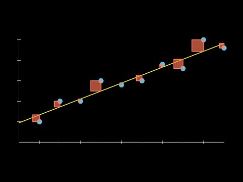
Imagine you’ve got a scatter plot, which is just a fancy way of saying you have dots on a graph that show data points. Each dot represents a student, with one axis showing hours spent studying and the other showing their grades. The goal is to find the straight line that best fits these points—that’s your regression line!
So, what does this line do? It helps us predict outcomes. If your friend studied for 5 hours, you can look at where 5 hours falls on the line and estimate what grade they might get. Pretty neat, right?
Now, let’s hit some key ideas:
- Dependent and Independent Variables: In our example, grades are the dependent variable because they depend on how many hours are studied (the independent variable).
- Slope: The slope of that line tells us how much change in grades comes from each additional hour of studying. A steep slope means big changes; a flat slope means not so much.
- Intercept: That’s where the line crosses the y-axis. It shows what happens when no hours are studied at all—like if someone gets their homework done without studying.
On a practical level, scientists might use this kind of analysis when looking at trends over time or comparing different groups. For example, say researchers want to see if there’s a link between exercise and cholesterol levels—they’d gather data and run linear regression to draw conclusions.
Here’s something cool: besides just making predictions, linear regression also gives us an idea of how reliable those predictions are. There’s something called the R-squared value that tells you how well your model explains the data. If it’s close to 1, you’re doing great; if it’s closer to 0? Well…not so much!
But remember, correlation doesn’t mean causation! Just because two things look related doesn’t mean one causes the other—it’s like thinking ice cream sales cause sunburns just because both go up in summer!
In conclusion, linear regression is like having a superpower for understanding relationships between variables in science or any field really. It helps people make informed decisions based on solid statistical evidence.
So when anyone talks about using linear regression in scientific applications, just think about those bright little dots on a graph leading you toward an answer—it really makes sense once you see it laid out!
You ever find yourself trying to predict something, like what the weather will be next week based on past patterns? That’s kinda like linear regression. It’s this nifty statistical method that helps us understand relationships between variables. I mean, let’s not get too technical here; you can think of it like connecting the dots in a way that helps you see a trend.
Okay, picture this: You’ve got a little lemonade stand, and you wonder how much money you’re going to make based on how many cups of lemonade you sell. So, you start keeping track. One sunny Saturday, you sold 10 cups and made $20. The next sunny Saturday, you sold 15 cups and made $30. Then another weekend, 20 cups for $40. See a pattern? More lemonade sold equals more money!
If you were to plot this on a graph with ‘cups sold’ on the x-axis and ‘money earned’ on the y-axis, you’d see these points starting to form a straight line going up. That’s where linear regression kicks in! It finds the best possible line through your points. This means it looks at all your data and figures out which slope represents your sales most accurately.
So here’s a quick emotional twist: remember your first lemonade stand? You were probably super excited every time someone bought a cup! Imagine if someone told you that based on how well you’ve done so far, they could predict your sales for the summer. That mix of hope and excitement? Linear regression is kinda like giving yourself that boost; it’s data helping make sense of your hard work.
But it gets even cooler! With linear regression, once you’ve got that line figured out—let’s say it predicts that for every additional cup sold, you earn two bucks—you can use it to forecast future earnings or even assess how different factors (like price changes or weather) might affect sales.
So yeah, whether you’re selling lemonade or diving into more complex stats down the road, linear regression gives you a way to turn chaos into clarity—one cup at a time! You follow me?