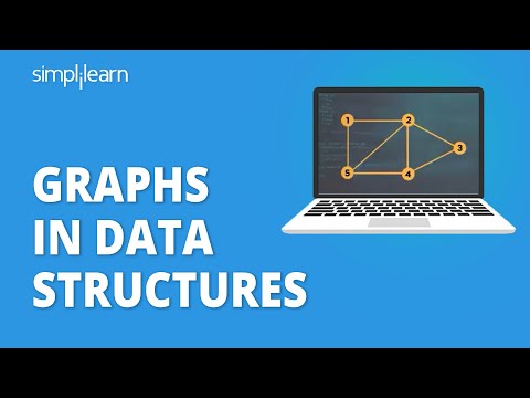
So, picture this: you’re at a party, and you suddenly find yourself in the middle of a wild game of telephone. Someone whispers a secret, it gets passed around like crazy, and by the end, it’s totally unrecognizable. That’s kinda like how information flows in our world—only it’s way more complicated!
Now, let’s talk about graphs. Not the boring charts your math teacher used to show you but cool graph data structures that help us understand everything from social networks to scientific research.
Imagine trying to map out every friendship in your life. It sounds chaotic, right? But when you use graphs, everything makes sense. You can see who knows who and how they’re all connected. That’s pretty much what’s happening behind the scenes in modern science!
These little structures are like invisible threads weaving through complex data, helping scientists make sense of it all. And trust me, once you get the hang of it, you’ll start seeing graphs everywhere!
Exploring the Real-World Applications of Graph Data Structures in Scientific Research and Innovation
Alright, let’s chat a bit about graph data structures and their role in scientific research and innovation. You might be thinking, “What even is that?” Well, think of graphs as a way to represent relationships between things. Imagine a social network—each person is a node, and the connections between them are the edges. It’s like your friend group where everyone knows someone else.
Graphs are super useful in various fields because they can show complex relationships clearly and simply. Take biology, for instance. When scientists study genes, they often create graphs to visualize how different genes interact with each other. It’s like drawing a map of a giant city where each road represents how one gene affects another!
In medicine, graph data structures can model the spread of diseases. Imagine tracking an outbreak; you can see how one infected person might connect to others through social networks or travel routes. An example that springs to mind is when researchers used graphs during the COVID-19 pandemic to track transmission paths effectively.
Then there’s ecology! Scientists model animal habitats using graphs too. Picture this: animals move through various terrains or habitats connected by their routes. By analyzing these maps, researchers figure out migration patterns or which areas need protection.
Graph algorithms also come into play when it comes to innovation in technology. For instance, in computer science, algorithms that analyze graphs help optimize processes—like finding the quickest route for deliveries or even enhancing recommendation systems for platforms like Netflix or Spotify.
Another cool application? The field of network science. Here, graph structures are essential for understanding everything from internet connectivity patterns to social dynamics within groups. Think about Facebook again; the way friends connect can reveal trends in behavior that researchers are keen on studying.
And let’s not forget about urban planning! City planners use graph data structures to model transportation networks—like bus routes or subway systems—to make them more efficient based on population needs.
So really, graphs aren’t just some abstract concept confined to math class; they’re part of the fabric of modern scientific research and innovation across diverse fields! They help us comprehend relationships and structure information better—for examples as vast as our understanding of living organisms all the way to complex human interactions.
Anyway, next time you hear someone mention graph data structures, you’ll know there’s a world of practical applications behind those seemingly simple nodes and edges!
Understanding the Impact of Graphs in Scientific Data Analysis: Enhancing Clarity and Insight
Graphs are more than just pretty pictures in reports—they’re a powerful tool in scientific data analysis. The thing is, when you’re looking at mountains of numbers, things can get super overwhelming. That’s where graphs come in to save the day. They convert complex datasets into visual insights that are easier to digest.
First up, let’s talk clarity. When scientists use graphs, it’s like giving their data a makeover. A well-designed graph can highlight trends, patterns, and outliers way better than a table crammed with digits. Think about it—if you see a line shooting up on a graph, you instantly know that something significant is happening there. Like when I was studying climate change data; honestly, the graphs made the rising temperatures feel so much more real than just reading numbers.
Next, we have structure. Graphs can take different forms: bar graphs, line charts, scatter plots—you name it. Each type serves a purpose based on what info you wanna convey. For instance:
- Bar graphs: Great for comparing different categories—like the number of species in various habitats.
- Line charts: Perfect for showing changes over time; imagine tracking population growth year by year!
- Scatter plots: Ideal for analyzing relationships between two variables—like how temperature impacts plant growth.
The right choice makes your findings crystal clear to others—or even yourself! It’s super important to know your audience too. If you’re presenting to fellow scientists, they might appreciate detailed scatter plots; but if you’re talking to policymakers? A simple bar graph could be way more effective.
Now let’s mention insight. Graphs don’t just display data; they enhance understanding. By visualizing connections or trends that might not pop out at you otherwise, they allow researchers to draw conclusions more easily. For example, when I stumbled upon a scatter plot showing the correlation between exercise and mental health improvements during my psych studies—it hit me hard! Seeing those dots cluster together made the relationship jump off the page.
A good graph has its own story. And what’s cool is that anyone can analyze and interpret these visual cues with some practice! Plus, using colors effectively helps convey messages faster—red for risks or green for positives could make all the difference in an important presentation!
Finally, let’s not forget accessibility. Not everyone grasps raw data equally well! Graphs break down those barriers by allowing people from different backgrounds—even those who may not have deep statistical training—to engage with scientific findings comfortably. Picture showing an interested friend your research: instead of drowning them in numbers over coffee, pull out some graphs and watch their eyes light up!
The takeaway here? Graphs make scientific data analysis clearer and richer with insights while being more approachable for everyone involved. So next time you’re faced with charts and numbers galore—just remember that those colorful visuals pack quite a punch in telling your scientific story!
Understanding Graph Data Structures: Key Concepts and Applications in Scientific Research
Graphs are super cool and a bit of a big deal in science. You might think of a graph as just lines and dots, but it’s way more than that. Basically, they are a way to represent relationships or connections between different items. These items can be anything—like people, cities, or even molecules!
When you look at a graph, you’ll see two main parts: **nodes** (or vertices) and **edges** (or links). Nodes are the individual points. Think of them as little circles on the graph. Edges are the lines that connect these nodes, showing how they relate to each other.
What makes graphs so important? Well, for starters, they help us model complex systems in science. For example:
- Social Networks: Let’s say you’re studying how diseases spread among people. By using graphs, you can show how everyone is connected—like who hangs out with who! This helps scientists figure out potential pathways for disease transmission.
- Biology: In biology, graphs can represent interactions among proteins or genes. Each protein could be a node, and if two proteins work together or interact somehow, there’s an edge connecting them.
- Chemistry: Chemists use graphs to illustrate molecular structures. Each atom is a node and chemical bonds are edges. This way of visualizing things helps chemists understand reactions better.
There’s also something called **directed** and **undirected** graphs. It’s kind of like reading a one-way street sign versus a two-way street sign. In an undirected graph, the connections don’t have directions; it just shows connections where both nodes interact equally. But in directed graphs, edges have arrows showing which node points to which—super handy for understanding things like workflows.
Now imagine if someone told you to analyze data about the habitats of endangered species across a landscape filled with mountains and rivers! Using graphs would help scientists visualize those habitats as nodes while adding edges based on shared ecological factors like food sources or climate conditions.
But there’s more! Graphs also have different properties that help researchers get deeper insights:
- Connectivity: This tells us if all parts of the graph are linked together somehow or if some nodes are isolated from others.
- Cyclic vs Acyclic: Some graphs loop back on themselves (like circles), while others don’t—this can matter when analyzing processes.
If everything sounds complex right now—don’t worry! There’s plenty of software out there to help scientists work with these structures without getting too lost in details.
In short, graph data structures aren’t just for computer nerds; they play a huge role in modern scientific research by simplifying complicated relationships into clear visuals. They’re essential tools that allow scientists to think outside the box—or should I say outside the node?
So, let’s talk about graph data structures. You might think they’re just a bunch of points and lines, but honestly, they’re way cooler than that. Imagine you’re trying to connect all your friends in a massive social network; each person is a dot, and the friendships are the lines. That’s basically what graphs do—they help us visualize and understand complex relationships.
A while back, I was working on a project where we had to analyze how diseases spread in populations. It hit me like a bolt of lightning how important graphs were in this scenario. We mapped out connections between people—who interacted with whom, which places were visited—and suddenly it all began to make sense. It’s like seeing the invisible threads connecting us all.
In science right now, graphs play such a crucial role. Think about biology: we have networks of genes influencing each other or food webs in ecosystems showing who eats whom. There’s even research on how to map out brain connections—neuroscientists are using these structures to figure out how our minds work.
And let me tell you about computer science! Algorithms use graph structures for everything from optimizing routes for delivery trucks (no one likes waiting on their pizza!) to finding the best way for data to travel across networks. Seriously, without these clever little graphs, modern computing would be like trying to find your way through a maze without any clues.
But here’s what really strikes me: graphs aren’t just for scientists or techies; they’re everywhere in our daily lives. Have you ever gotten lost while driving? Your GPS is probably working with some form of graph data structure! It calculates the best routes based on distances and traffic patterns.
So when you sit back and think about it—a seemingly simple concept can hold so much power! It helps us see patterns, understand relationships, and even predict the future in ways that are seriously mind-blowing. Next time you hear someone talk about graphs in science or tech, just nod along because now you know—those dots and lines are doing some heavy lifting behind the scenes!