So, let me tell you about a really bizarre party I once went to. There were like five people dancing and then suddenly, out of nowhere, a whole crowd of fifty more burst in! It was the weirdest thing ever. That crazy moment made me think about how data can be just as unpredictable.
That’s where kurtosis comes in. It’s one of those fancy-sounding stats that helps us understand how our data behaves—especially when it comes to those wild extremes or “tails.” You know, the stuff that can really skew things if we don’t pay attention?
Imagine you’re looking at test scores in a class. Most students did well, but one genius got a perfect score while another bombed it hard. Kurtosis is like the friend who whispers to you, “Hey, don’t ignore those outliers!”
So yeah, stick around and let’s break down this quirky little concept together. You’ll see why it’s not just some number crunching—it’s actually pretty cool!
Understanding Standard Deviation: A Key Statistical Tool in Scientific Research
Standard deviation is one of those statistical tools that people in research often lean on. Think of it as measuring how spread out the numbers are in a data set. If the numbers are all really close to each other, you get a small standard deviation. If they’re all over the place, then the standard deviation is larger. It’s helpful for understanding reliability and consistency in data.
So, let’s break it down a bit. When you calculate standard deviation, what you’re doing is looking at how far each number in your data set is from the mean (that’s just the average). You take each number, figure out how far it is from that average, square those distances so they’re all positive, and then find that mean of those squared distances. Finally, you take the square root of that result to get back to your original units.
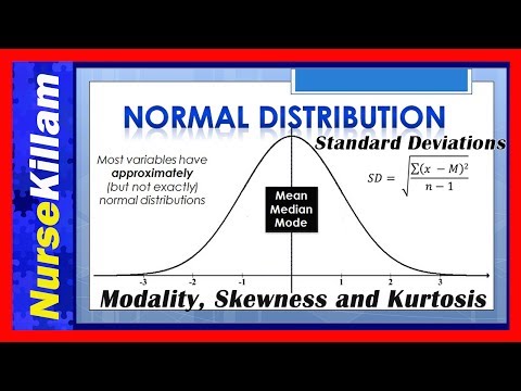
Kurtosis, on the other hand, deals with tails—the extremes of your data distribution. It tells you about the “peakedness” and tail heaviness of your dataset compared to a normal distribution (which looks like a bell curve). A high kurtosis means more data points are found in the tails and less around the mean; think of it as more extreme outcomes happening than you’d expect.
So how do these two concepts connect? Well, both standard deviation and kurtosis provide insights into variability and risk in your data. You can have a low standard deviation but still have high kurtosis—meaning most values might be clustered together but extreme values exist too! This can happen with financial returns where you might see consistent daily returns (low standard deviation) but occasionally huge losses or spikes (high kurtosis).
Here’s an example: Let’s say you’re studying students’ test scores. If most students scored between 85-95 with very few outliers like someone scoring 20 or 100, you’d find both a low standard deviation and low kurtosis because most scores cluster tightly around that average score.
But if another class had scores mostly between 60-70 with some scoring way below 30 or above 90? You’d see that their standard deviation would increase because there’s more movement away from their average score—plus possibly higher kurtosis since those extreme scores pop up unexpectedly.
In research, understanding both measures gives you more power over interpreting your data effectively. You can spot trends better and make predictions based on how variable or risky certain outcomes can be!
In summary:
- Standard Deviation: Measures dispersion around the mean.
- Kurtosis: Looks at tail behavior—how extreme values compare to typical ones.
- Both help researchers understand variability in datasets.
- You can have low spread yet still encounter unexpected extremes.
Next time you’re staring down some statistics, remember these two concepts—they’re pretty much best buddies when it comes to making sense of numbers!
Understanding Kurtosis: Analyzing Data Tail Behavior in Statistical Science with Illustrative Examples
Kurtosis is one of those terms you might bump into while studying statistics. But what does it actually mean? So, let’s break it down. In simple words, kurtosis is all about the shape of the distribution tails in your data. It helps you understand how much of your data falls into the extreme ends as opposed to around the average.
When we talk about kurtosis, it’s usually in comparison to a normal distribution. A normal distribution is like that bell-shaped curve you might’ve seen in graphs. Now, kurtosis tells us something important: how heavy those tails are. Basically, it highlights whether there are more outliers or if most of the data is clustered closer to the mean.
There are three main types of kurtosis:
- Mesokurtic: This is your standard normal distribution. The tail behavior here is pretty regular, which means it’s neither too heavy nor too light.
- Leptokurtic: Here’s where things get interesting! A leptokurtic distribution has heavier tails and a sharper peak compared to a normal distribution. This means there are more extreme values or outliers.
- Platykurtic: On the flip side, a platykurtic distribution has lighter tails and a flatter peak than the normal curve. This suggests that there are fewer extreme values—most data points are closer to the average.
To put this into perspective, imagine you’re throwing darts at a target! If all your darts land close together with just a few that stray far away, that’s like leptokurtic behavior. Those stray darts are your outliers! But if your darts spread out widely across the target with most landing instead right around the center—a classic platykurtic scenario.
A practical example could be test scores from two different classes. Class A’s scores are tightly clustered around 75%—a nice little grouping near average with just a few students scoring much higher or lower; this could be considered platykurtic. Meanwhile, Class B may have students scoring all over: lots of high flyers above 90% and many struggling below 50%, showing that leptokurtic trait!
Another thing to remember about kurtosis is how it affects statistical analyses—you know? When dealing with prediction models or hypothesis tests, knowing whether you’re working with heavy-tailed distributions can change outcomes and interpretations significantly.
Lastly, kurtosis isn’t just critiquing shape for funsies; it’s practical! If you’re using financial data for investments, understanding tail risks can mean avoiding potential disasters—or seizing golden opportunities!
So when you’re crunching numbers next time and come across kurtosis in your analysis toolbox, remember it’s not just a fancy term but rather an insightful measure of how your data behaves at both ends of that spectrum! Cool right?
Understanding Kurtosis: Analyzing Tail Behavior in Statistical Data through Formulaic Interpretation
Understanding kurtosis can seem like a bit of a puzzle at first, but once you get the hang of it, it’s actually pretty interesting. Let me break it down for you.
Kurtosis deals with the **shape of the distribution** of data points in a dataset. You know how some graphs look flat and sweet, while others pop up high in the middle? Well, kurtosis helps us analyze just that. It’s all about how heavy or light those tails are compared to a standard bell curve.
When we talk about these tails, we’re referring to the extremes in our data set—those points that appear very far from what’s considered “normal.” And let me tell you, there are three main types of kurtosis:
- Mesokurtic: This is like your classic bell-shaped curve. It has a kurtosis value around 3.
- Leptokurtic: Imagine a taller and thinner peak—this one has more weight in the tails and shows values greater than 3. Think about stock market returns; they can be quite leptokurtic sometimes!
- Platykurtic: Here’s where things flatten out. This type has fewer outliers and values less than 3.
You might wonder why we even care about this stuff in real life. Well, consider something as unpredictable as gambling or stock trading. When a distribution is leptokurtic, it means there’s a higher chance for extreme outcomes—good or bad! That could mean your odds at winning big or losing big are more likely than you’d expect.
So how do we calculate kurtosis? The formula might look like some complex math sorcery at first glance. But essentially, you’re looking at the average of the fourth power deviations from the mean divided by the square of the variance:
[ K = frac{n(n+1)}{(n-1)(n-2)(n-3)} sum left( frac{x_i – bar{x}}{sigma} right)^4 – frac{3(n-1)^2}{(n-2)(n-3)} ]
Not super simple, right? But don’t stress! The key takeaway here is that you’re measuring how often extreme values pop up in your data compared to what you’d expect with standard distributions.
I remember sitting through stats class where we analyzed test scores for students across different schools. One school had lots of brilliant kids scoring high while another had many struggling students; one showed leptokurtic behavior because those extreme scores skewed its shape significantly! It was eye-opening to see how this concept plays out in real-life situations.
To sum up (without getting too technical), understanding kurtosis can give you valuable insight into your data’s tail behavior: whether you’re facing mild waves or wild extremes lurking there. Keep an eye on those tails—they might just surprise you with what they reveal!
Okay, let’s chat about kurtosis. Yeah, I know it sounds like one of those fancy words you’d hear in a statistics class that makes you go “huh?” But it’s actually pretty interesting once you wrap your head around it. So, let’s break it down a bit.
Kurtosis is all about understanding how the tails of your data behave. Imagine you’re at a party—stick with me here—and there’s always that one guy who stays way too late. You know the type? The life of the party at first, but then he starts drinking too much and causes a scene. The tails of a dataset are like him—representing those extreme values that can really skew things if you’re not careful.
Now, normally when people talk about data distributions, they mention mean and median and other stuff like that. But kurtosis dives deeper into the shape of the distribution itself, telling you whether your data has heavy tails (like our party guy) or light tails (a more chill crowd). A high kurtosis means there are more outliers—the wild ones hanging around after everyone else has left the building—while low kurtosis suggests your data is more “normal,” if you can say that about people.
Here’s the tricky part though: it doesn’t just tell you how extreme those values are; it also hints at how often they might pop up. For example, if you’ve got a dataset with high kurtosis, those strange outlier values could crash in often enough to cause real drama in your results! Kind of makes you think twice about trusting just averages or what looks normal on the surface.
I remember this one time back in college when we were analyzing sports statistics for fun—a group project where I thought we’d just have an easy time crunching some numbers. Well, we found out that there were some players who had insane performances during specific games that skewed our averages way off from what you’d expect for an average player. Realizing this was a light bulb moment for us because we learned to pay attention to those extremes—thanks to understanding kurtosis!
In short, while it might seem like jargon at first glance, getting familiar with kurtosis can really give you insight into your data’s behavior—kind of like understanding which friends are going to stick around after last call! You start seeing patterns and potential pitfalls that could otherwise trip up someone relying on just basic stats alone. So next time you’re tossing numbers around or analyzing some trends, take a second to consider those tails—it might just save you from making rookie mistakes along the way!