So, picture this: you’re at a party, and everyone’s gathered around the punch bowl. You know the one—bright red with floating fruit, and some mysterious fizz bubbling up. Suddenly, someone spills it everywhere! There’s a rush of laughter, drinks flying through the air—it’s chaos!
Now, that’s kind of what kurtosis is like in statistics. It measures how much your data is partying—whether things are chilling out or going wild.
You might be thinking, “Kurtosis? What’s that got to do with normal distribution?” Well, my friend, strap in! This concept tells us whether our data’s playing it safe or getting a little crazy.
And that has some serious scientific significance! So let’s unravel this together and see why it matters in the big ol’ world of data.
Understanding Acceptable Kurtosis Levels in Normal Distribution: A Scientific Exploration
So, let’s chat about kurtosis and why it matters in statistics, especially when we’re talking about normal distribution. You might be wondering what the heck kurtosis even is. Well, it’s basically a way of measuring the “tailedness” of a distribution. That’s a fancy term for how much of the data is in the tails versus the center.
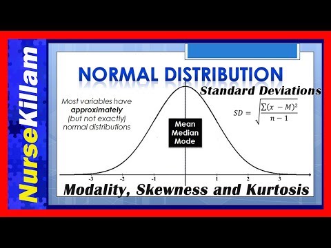
Kurtosis gives us an idea of how extreme our data points can be. When we think about a normal distribution, we imagine that nice bell curve shape, right? The classic example where most of our data clusters around the mean. But, depending on its kurtosis, that bell can look a bit different.
Now, there are three types of kurtosis: mesokurtic, leptokurtic, and platykurtic. Each type tells us something specific:
- Mesokurtic: This is your standard normal distribution. It has a kurtosis of 3 (if you’re using excess kurtosis, it’s 0). It means that it behaves just as you’d expect from typical bell curves.
- Leptokurtic: This one’s got heavy tails and a sharper peak compared to mesokurtic distributions. You might see kurtosis values greater than 3 here. Basically, more data points fall at extremes—think outliers popping up!
- Platykurtic: These distributions are kind of flat with less extreme values. The kurtosis here is less than 3—a sign that there aren’t many outliers hanging around.
So why should you care? Well, understanding these levels helps statisticians determine the likelihood of extreme events occurring in their data sets. For instance, if you’re analyzing stock market returns and find leptokurtic behavior, be ready for those wild swings—there could be some surprising highs and lows!
And guess what? It’s also crucial in fields like quality control or risk management where knowing whether your data skews toward extremes can influence decisions big time.
But don’t get too hung up on just numbers! Remember that statistical tools are meant to guide us through uncertainty—not to dictate every outcome as if they had crystal balls! Data doesn’t always fit neatly into boxes; sometimes things get messy—and that’s totally fine.
In essence, understanding acceptable levels of kurtosis in normal distributions gives us insight into both the average behavior and those outlier surprises lurking at both ends. So next time you see this term pop up, you’ll know it’s more than just some geeky statistic—it actually reveals what your data might be hiding!
Understanding High Kurtosis: Implications for Data Analysis in Scientific Research
High kurtosis can be a bit of a tricky concept, so let’s break it down into simple terms. Basically, kurtosis is a statistical measure that tells us about the shape of a data distribution. When we talk about high kurtosis, we’re referring to how “peaked” or “heavy-tailed” the distribution is compared to a normal distribution.
Now, imagine you have two hills in front of you. One is nice and smooth, which represents the normal distribution—most data points cluster around the mean. But then there’s the second hill, steep and pointy at the top with wider slopes; this is what high kurtosis looks like. You see more extreme values or outliers hanging around because those tails are really heavy.
Why is this important? Well, high kurtosis can indicate that your dataset might contain some surprises. Let’s look at a couple of key implications:
- Data Extremes: In research, this means you might encounter rare but very significant events more often than you’d expect. For instance, if you’re studying financial returns and notice high kurtosis, it could mean that there are days with dramatic market fluctuations lurking–like during major financial crises.
- Assumptions Violation: Many statistical methods assume normality of data. When kurtosis is high, these methods could lead to misleading results because they don’t handle those extreme values well.
- Error in Estimation: If you’re estimating means or variances assuming normality when there’s high kurtosis, your estimates might be off—think of it like trying to fit a pancake into a round cookie cutter!
If you’ve ever done any research involving survey data or biological measurements, you’ve probably encountered high kurtosis without realizing it! Say you’re measuring students’ test scores in an advanced class. You might find most students scored well (the peak), but then there’s that one student who aced it beyond all expectations while another barely scraped by with almost no knowledge—they create those heavy tails in your distribution.
Anecdote time: I once worked on analyzing environmental data from a river’s pollution levels over several years. At first glance, everything seemed normal until we spotted some spikes—those were days after heavy rainfall when runoff drastically changed the water quality. It was like watching the river throw curveballs at us! That was our high kurtosis moment; understanding that helped inform better environmental assessments moving forward.
The bottom line? Always keep an eye on kurtosis when analyzing your data! It’s like looking for hidden clues that can change how you interpret results and make decisions based on them.
Understanding Kurtosis: What a Value of 0.6 Reveals in Statistical Analysis
Let’s chat about kurtosis, shall we? It’s one of those fancy statistical terms that sounds big and complicated but is actually pretty interesting once you break it down. Basically, kurtosis helps us understand the shape of a distribution. When we talk about kurtosis, we’re looking at the “tailedness” of a dataset—how heavy or light the tails are compared to a normal distribution.
Now, if you encounter a kurtosis value of 0.6, that tells you something specific about your data. You see, in statistics, a value of zero means the distribution is similar to a normal distribution—pretty standard stuff. A positive kurtosis indicates heavier tails or more outliers than you’d expect from a normal curve. On the flip side, if it’s negative, like in our case (since 0.6 can be viewed as less than 3 for excess kurtosis), it suggests lighter tails.
What does this mean practically? Well, when you’re working with a dataset that has a kurtosis of 0.6, you’re looking at something called platykurtic. This means your data has fewer extreme values compared to what you’d expect with a normal distribution. So instead of wild swings or outliers that could throw off your analysis, you might find more consistency in your results.
To make this clearer, let me give you an example: Imagine you’re testing people’s heights in two different groups: one group represents high school students and another represents professional basketball players. The heights in the basketball group would likely show high positive kurtosis because there are outlier values—those really tall players! Meanwhile, the heights among high school students might have lower kurtosis (like our 0.6), suggesting most students fall within average ranges without too many exceptionally tall or short individuals.
This doesn’t just help with analyzing height; understanding kurtosis is crucial across fields like finance when assessing risk or quality control in manufacturing where consistency matters.
- Kurtosis explains shape: It describes how concentrated or dispersed data points are around the mean.
- A value of 0: Indicates a normal-like distribution.
- A positive value: Means heavier tails and potential outliers.
- A negative value: Indicates lighter tails; fewer outliers expected.
If you’re doing some serious data analysis and hit on this number—0.6—it should give you insights into how stable or predictable your dataset is likely to be!
Alright, so let’s chat about kurtosis and how it fits into the whole normal distribution scene. Imagine you’re out with friends, and you’re comparing your heights or something. Most of your crew is around the same height, but there’s that one friend who’s either a giant or really tiny. You know, those outliers that make things interesting? That’s sort of what kurtosis is all about.
Kurtosis measures the “tailedness” of a distribution. It tells us how much of our data is in the tails (i.e., the extremes) versus how much is in the center. In a perfect normal distribution—think of that nice bell curve—you get what we call “mesokurtic.” It has a certain amount of tail weight and shape. But when things get funky—like if those outlier friends start showing up more often—you might find yourself in a situation called leptokurtic or platykurtic.
Leptokurtic distributions have heavy tails, which means you have more extreme values popping up than you’d expect under a normal curve. Picture an exhilarating rollercoaster: thrilling drops and sharp turns! On the flip side, platykurtic distributions have lighter tails; they’re more like gentle hills with fewer surprises waiting for you at the edges.
You know, this stuff isn’t just academic; it really matters in real life too! For instance, if you’re investing or dealing with risk assessments, understanding kurtosis can help predict potential extreme events—the kind of stuff that could make or break your fortune! Imagine being caught off guard by an unexpected market crash; having an idea about those tail risks could save you from some serious headaches.
And I can’t help but recall one time when I was taking part in this statistics course. We were doing this exercise where we collected data on everyday things like our coffee consumption or gym visits. One person tracked their activities religiously while others were all over the place—it was hilarious! But there, right in our little dataset, we saw how those few obsessed individuals skewed our results towards heavy tails when discussing averages. The messiness made us laugh but also made us realize just how much attention we need to pay to those outliers and what they mean for understanding trends.
So yeah, kurtosis might sound super technical at first glance—just another statistic floating around—but it’s seriously significant for anyone trying to make sense of data patterns. It nudges us to dig deeper into not just where most people fall but also what’s happening at the edges. And isn’t that where life gets interesting?