You ever try to explain something to a friend and end up lost in data? Like, “I swear this chart makes sense!” Yeah, that’s how I felt when I first dove into regression analysis.
So, what even is regression analysis? Picture this: you’re trying to figure out if studying more leads to better test scores. Regression helps you see if there’s a connection between the two. It’s like unlocking the mystery of your grades!
And guess where you can do this magic? Excel! Yup, that trusty spreadsheet has some neat tricks up its sleeve for scientists and researchers—or honestly, anyone who wants to make sense of numbers.
Let’s chat about how you can wrangle your data into something meaningful without losing your mind in the process. Sound fun?
Exploring Regression Analysis in Excel: A Comprehensive Guide for Scientific Research
When you’re digging into data analysis, regression analysis in Excel is like your trusty flashlight in a dark cave. You turn it on and suddenly, patterns and relationships start to emerge. So, what is regression analysis? Well, it’s basically a statistical method that helps you understand how one variable affects another. You follow me? Think of it as trying to figure out how studying habits influence exam scores.
Here’s the thing: with regression analysis, you can predict outcomes. For example, if you’ve got data showing study time and test scores for a bunch of students, you could use regression to predict how much higher scores might go with just a bit more study time.
Now, Excel has some pretty neat tools for this. So how do you get started? First off:
- Data Preparation: Before anything else, make sure your data is clean and organized. Having columns for your independent variable (like study hours) and dependent variable (like exam scores) makes things super simple.
- The Data Analysis Toolpak: This built-in Excel feature can be your best buddy! If it’s not enabled yet, just go to ‘File,’ then ‘Options,’ find ‘Add-ins,’ and check the box next to Data Analysis Toolpak.
- Selecting Regression: Once the Data Analysis option appears under the ‘Data’ tab, choose ‘Regression.’ Fill in the input ranges for both your Y (the outcome) and X (the predictor).
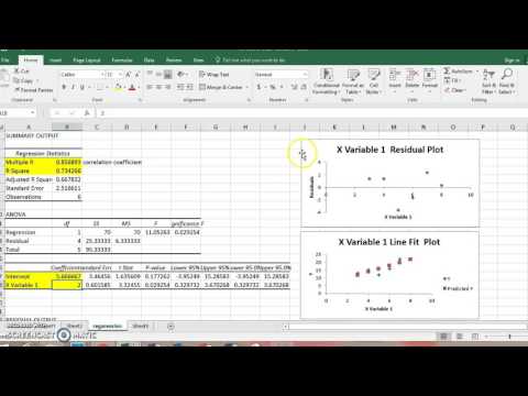
When you’ve set everything up right and hit “OK,” Excel runs its magic and gives you an output summary. You’ll see coefficients that tell you how much change in Y corresponds to a one-unit change in X.
The R-squared value, which is part of that output summary too, is super important! It tells you how well your model explains the variability in your outcome variable. A value closer to 1 means a better fit—so if you’re getting something like 0.85 or higher? High five! You’re doing great!
You know what’s cool about regression analysis? It can be more than just linear! You can explore polynomial regression too if things look more curvy than straight lines when you plot them out. This means fitting curves instead of just lines if that’s what the data suggests.
I remember this project I worked on where we were analyzing plant growth based on different levels of sunlight exposure. At first glance, the relationship didn’t look linear at all. But after trying out polynomial regression in Excel? We found an awesome curve that really captured how growth accelerated with optimal sunlight levels!
If you’re feeling adventurous, Excel also allows for multiple regression. This takes into account more than one independent variable at once—crunchy stuff like considering both study hours *and* sleep quality when predicting exam scores!
- Interpreting Outputs: Watch out for p-values too! They help determine whether your relationships are statistically significant or just random noise.
- Bugs beware! Sometimes multicollinearity happens—when independent variables are too closely related—which can mess with your results. Keep an eye on those correlations!
The bottom line here is that using regression analysis in Excel isn’t just about crunching numbers; it’s about telling stories with those numbers—finding patterns that reveal deeper truths about whatever research question you’re passionate about. With practice and patience, you’ll be wading through datasets like a pro before long!
Exploring the Capabilities of ChatGPT in Conducting Regression Analysis in Scientific Research
Hey! So you wanna chat about ChatGPT and how it can help with regression analysis in scientific research? Let’s break it down a bit, yeah? Regression analysis is like a super handy tool for figuring out relationships between different things. Like, if you’re studying how much sunlight affects plant growth. You’d want to know if the more light, the taller the plants get, right?
Now, here’s where ChatGPT comes in. Imagine you’re a researcher and you have loads of data from an experiment. Instead of wading through spreadsheets by yourself—yawn—ChatGPT can help you understand and interpret that data. It won’t crunch the numbers directly like Excel does, but it can guide you through using Excel’s regression tools.
So what does regression analysis do? It helps you create a mathematical model based on your data. For example:
- If you plot your plant height against sunlight hours, regression helps find the line that best fits those points.
- This line is called the regression line, and it shows how well your data correlates.
- You can then make predictions! Like, if I give my plants x amount of sunlight, how tall will they grow?
In Excel, getting to regression analysis is pretty straightforward too! You go into the Data Analysis Toolpak (you gotta enable this first). From there:
- Select Regression.
- Choose your Y-range (dependent variable), like plant heights.
- Your X-range (independent variable), like sunlight hours.
And boom! You hit OK and voilà—you’ve got results!
Now back to ChatGPT. Although it’s not analyzing numbers directly for you, it’s great at answering questions about interpretation. Like if you’re unsure what an R-squared value means—like seriously, what is that?—you could ask ChatGPT! It’ll explain that R-squared tells you how well your regression line fits your data.
But here’s a little anecdote: once I was helping a friend with their research project on temperature effects on fish growth. They were nervous about tackling all those stats in Excel alone. So we sat together and used ChatGPT to clarify confusion about terms and methods while they input their data into Excel for regression analysis. It made everything way less intimidating!
In summary: ChatGPT isn’t gonna replace tools like Excel when it comes to crunching numbers. But it’s like having a super knowledgeable friend by your side who helps you make sense of things while exploring the massive world of regression analysis in scientific research.
So next time you’re neck-deep in stats or trying to find patterns in your experiment data, remember that you’ve got some handy support around—even if it’s just chatting with an AI!
Mastering Regression Analysis for Scientific Research: A Comprehensive Guide
Regression analysis? It sounds like a mouthful, but honestly, it’s just a super cool way to understand relationships between variables. Imagine you’ve got a bunch of data points, like how much you slept and how well you did on a test. Regression helps you figure out if one affects the other, or if they’re just dancing around together.
When we talk about using regression in scientific research, especially with tools like Excel, it’s all about finding patterns and making predictions. So let’s break it down into some important bits.
What is Regression Analysis? It’s basically a set of statistical methods to examine the relationship between one dependent variable (what you’re trying to predict) and one or more independent variables (the factors that might influence it). Got that?
Why Use It? Well, regression can help scientists make sense of complex data. Say you’re looking at how different factors affect plant growth. You can input data about sunlight exposure, soil quality, and water intake, and regression will help see which ones really matter for that growth.
Now, Excel is pretty handy for this kind of analysis! You don’t need to be a math wizard; the program does a lot of heavy lifting for you. Here’s how you might do it:
- Input Your Data: Start with your numbers ready to go. Put your dependent variable in one column and independent variables in adjacent columns.
- Access Data Analysis Tool: Go to the ‘Data’ tab and find ‘Data Analysis.’ If it’s not there, you’ll need to add the tool from Excel options.
- Select Regression: Choose ‘Regression’ from the list. You’ll then get prompted to select your Y Range (dependent variable) and X Range (independents).
It might seem intimidating at first glance —like learning to ride a bike without training wheels— but once you’re rolling along it gets easier!
After running the regression in Excel, you’ll get an output with lots of info! Look out for:
- R-squared value: This tells you how well your model explains variations in the data —the higher it is (closer to 1), the better!
- P-values: These help determine whether your independent variables significantly affect your dependent variable. A low p-value (usually under 0.05) means there’s likely an effect.
And here’s where it gets real —when I was working on my thesis about plant reactions under stress conditions, I remember sweating buckets over my dataset. But once I plugged everything into Excel and saw that R-squared inching up as I added more relevant factors? Man! That eureka moment felt great!
Of course, be cautious: correlation doesn’t mean causation! Just because two things seem tied together doesn’t automatically mean one causes the other.
At the end of the day, mastering regression analysis lets you sift through piles of info and emerge with meaningful conclusions from your scientific experiments or studies. It’s like finding clarity in chaos —and who doesn’t want that?
So, regression analysis in Excel, huh? It’s really something quite powerful. Imagine you’re trying to figure out if there’s a link between how much time you spend studying and the grades you get. Like, it’s not just about guessing what might be true; it’s about using data to find out for sure!
I remember back when I was knee-deep in my college research project—those late nights fueled by coffee and sheer determination. I had all this data from my experiment, but honestly, it was a bit overwhelming. I mean, where do you even start? That’s when my buddy told me about regression analysis in Excel. It felt like stumbling upon a hidden treasure.
So, let’s break it down a bit! Basically, regression analysis lets you see patterns and relationships between variables. In Excel, you can create pretty straightforward models without needing to be a math whiz or anything. You just plot your data points on a graph and fit a line to see how closely they relate. It’s almost like connecting the dots but with numbers!
But here’s the kicker: it doesn’t stop at just telling you if there’s a relationship. It can also give you an equation! This little formula can predict outcomes based on new inputs. If you give it X hours of study time, it’ll tell you an expected grade—how cool is that?
Of course, it’s not infallible; sometimes the results can feel counterintuitive or even misleading if you’re not careful or don’t have enough good quality data. Still, it’s so useful for scientific research—like giving your hypotheses that extra bit of support!
And hey, for anyone who’s ever felt stuck in their research journey (yup, that was me), using tools like this not only brings clarity but also makes the whole process feel way more manageable and exciting! So yeah, next time you’re wrestling with some data, think about diving into regression analysis—it might just turn chaos into clarity!